PORTELES
a welfare complex in Chania, Greece, 2020
Project Details
status : competition distinction
typology : nursery, elderly care centre, educational building
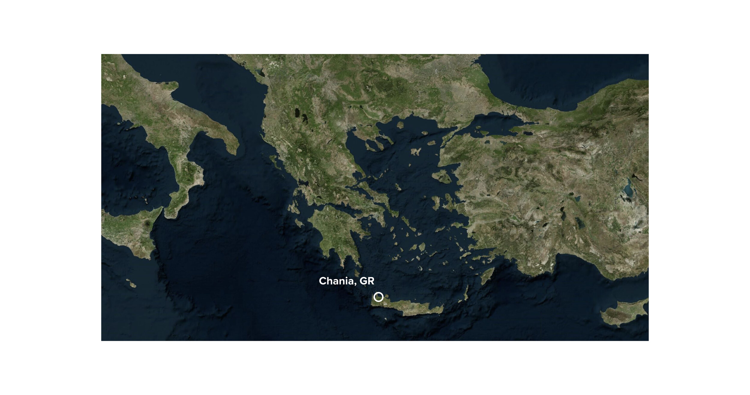
location : Chania, Greece
client : Municipality of Chania
year : 2020-2021
team : Despoina Papadopoulou, Katerina Examiliotou
collaborators : Dimitris Mamadas, Stefanos Chatziilias, Giorgos Klepkos,
consultants : Elena Papantoniou, Galini Afentoulidou, Katherina Bruh
Project Submission
Project Description
Why Bring Generations Together? Intergenerational care officially started in 1976 in Tokyo where a nursery was combined with the function of an elderly home with great success. Intergenerational programs help young children experience improvements in behavior, increase their self-esteem and sense of empathy. They also develop opportunities for senior people to continue engaging with and contributing to their communities while increasing their feelings of belonging and well-being. This type of intergenerational solidarity helps address our society’s pervasive ageism, which undermines the obligations that we have to one another.
How does one combine architecturally a Nursery and Preschool with an Elderly Daycare Centre? That was the question of the architectural competition organized by the Municipality of Chania, on the island of Crete, for a new Welfare Complex and a Neighborhood Park. Mazi Architects won the 1st distinction for their proposal “Porteles”, a reflection on the central role care facilities can play in a community.
Inspired by the clarity, modesty and economy of traditional Cretan architecture and applying the principles of sustainability and circular economy, our design proposes a composition of indoor and outdoor spaces with a strong architectural identity. The building complex is integrated harmoniously in the neighborhood whilst allowing Nature to be the main stage where activities take place.
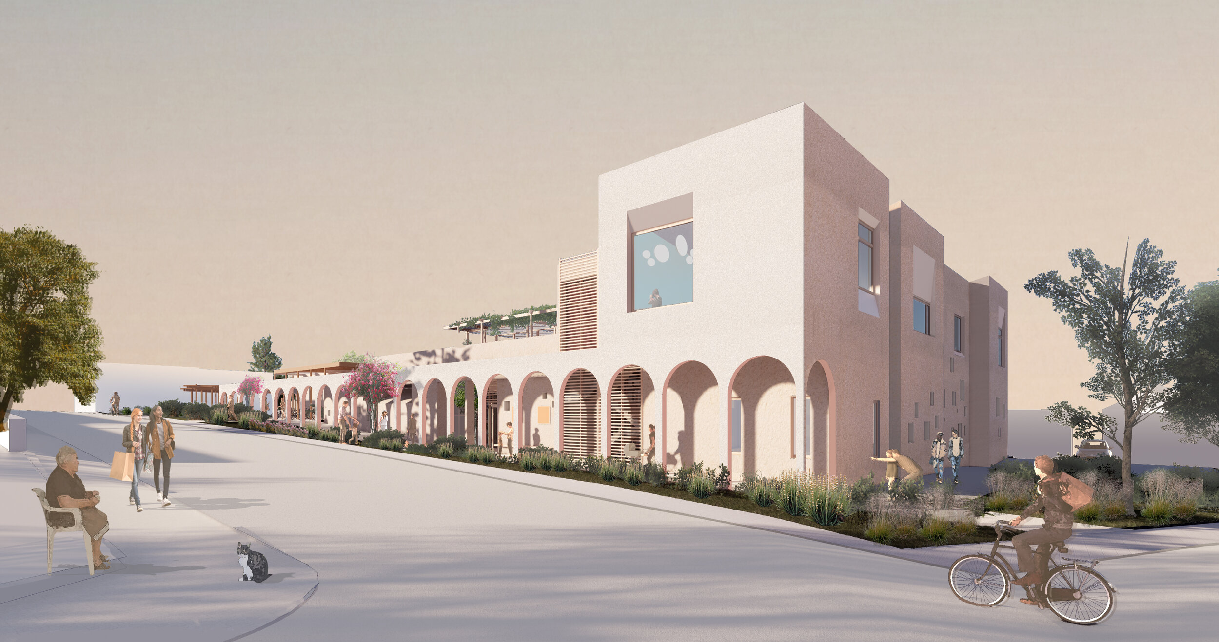
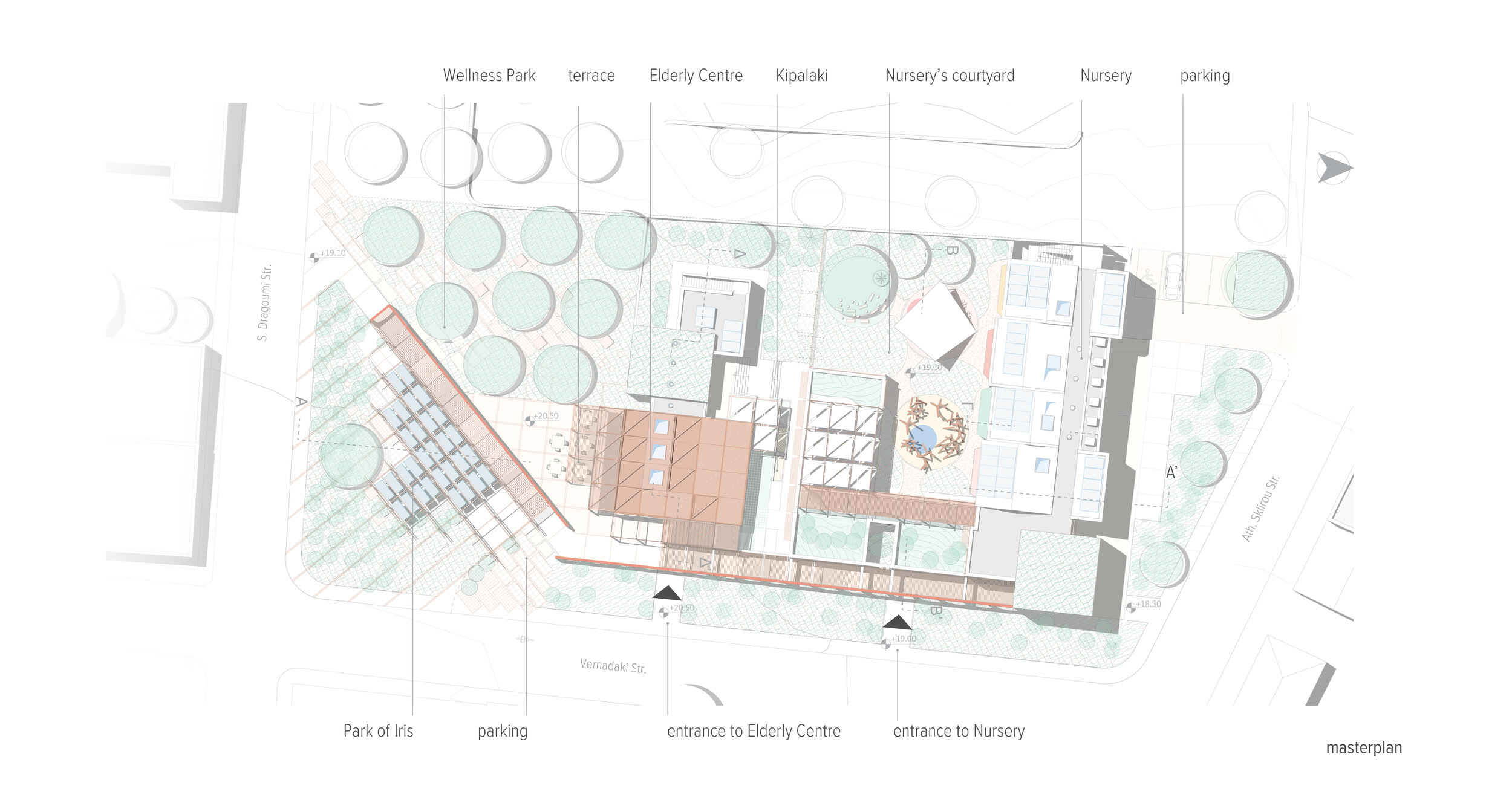
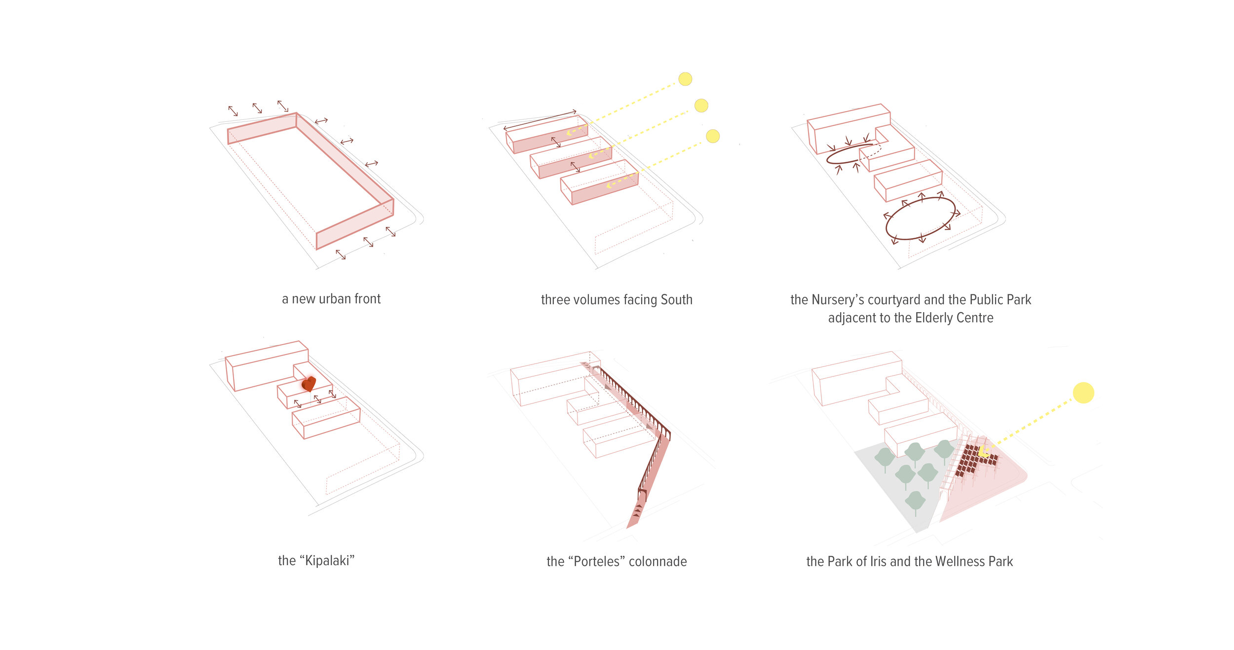
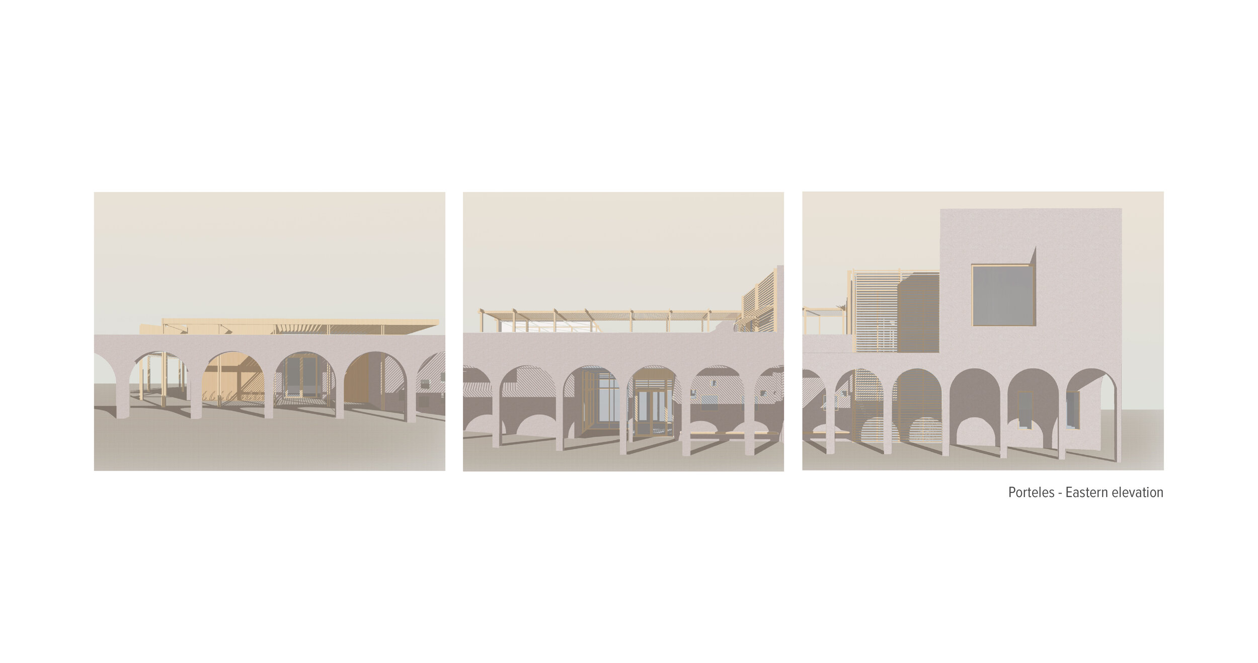
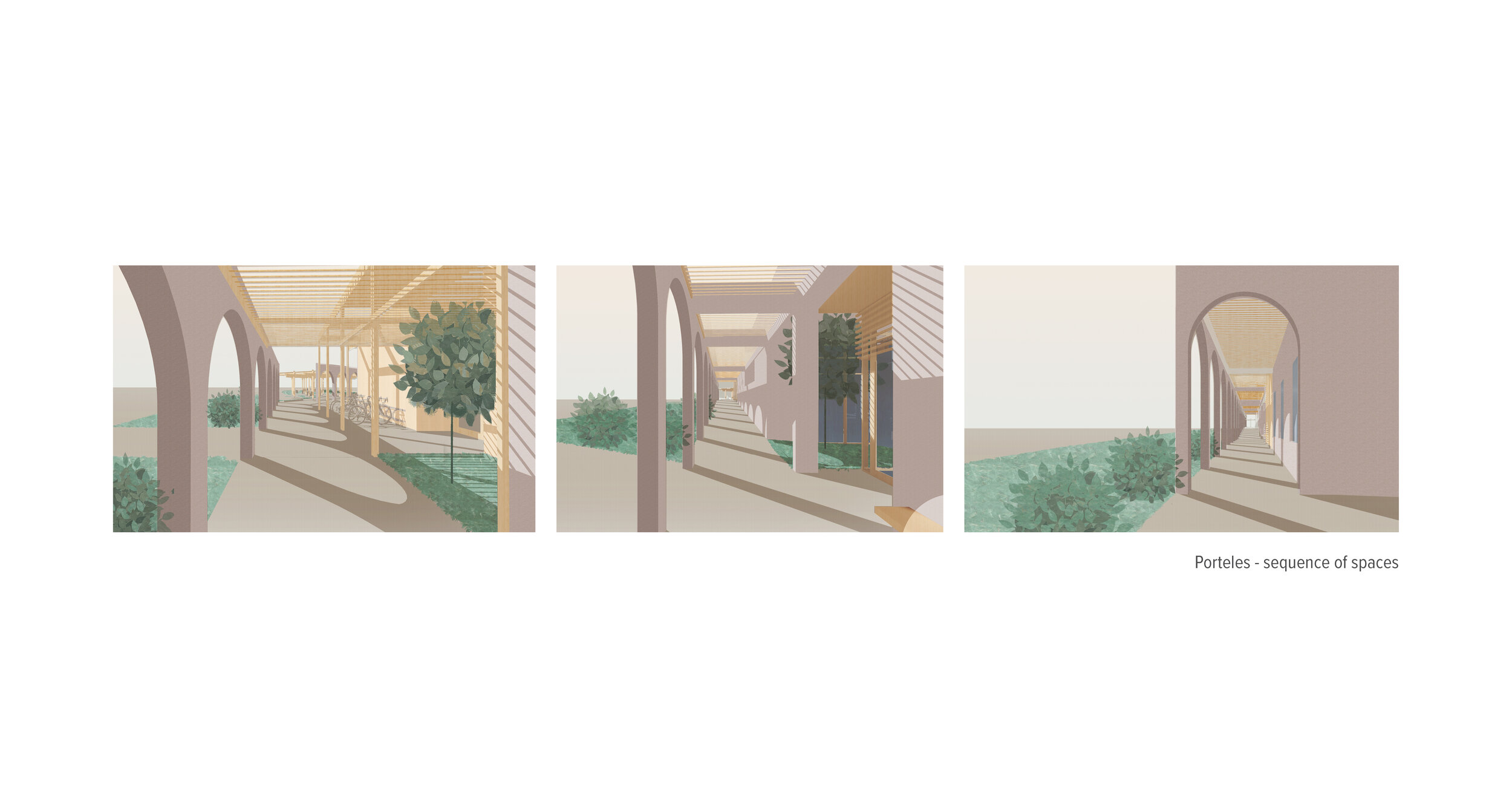
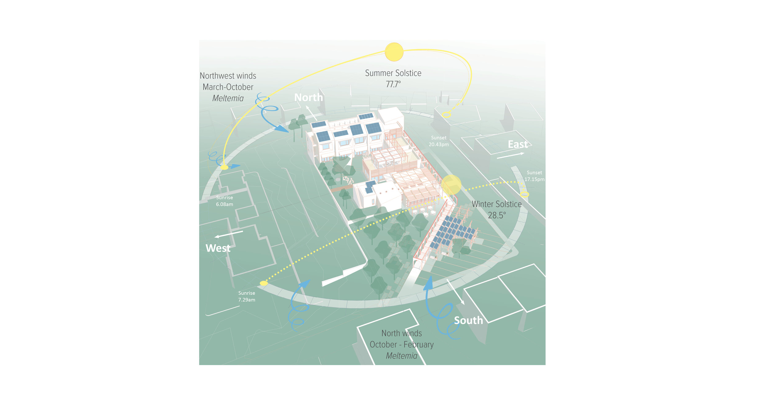
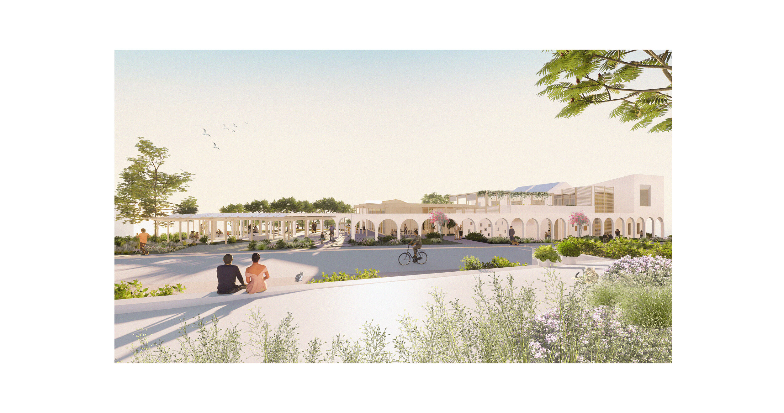
The site, shared with the recently built Health Center, expands over a linear plot along the North - South axis. Our first response was to create a new urban front that ‘completes’ the plot and creates a unifying visual language while acting as a boundary between the public and more private functions of the building program. This new urban front is materialized as a Colonnade; a shaded, protected from the natural elements path, that organizes the entrances to the individual buildings whilst offering a sequence of ‘framed’ moments to the passerby.
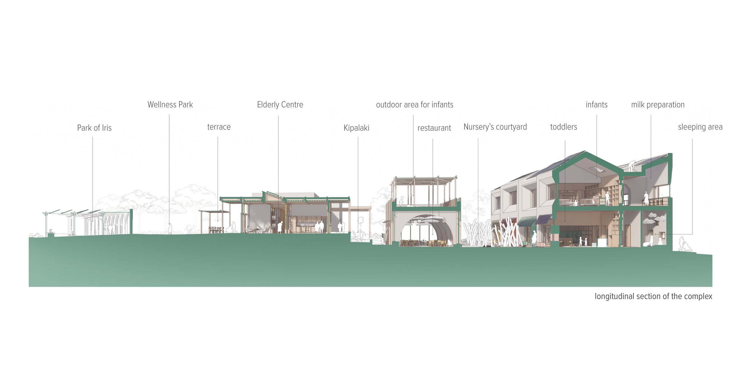
The building program is distributed in three simple rectilinear volumes that stretch perpendicular to the Colonnade along the East-West orientation, thus maximizing the south frontage and allowing permeable cross ventilated spaces. The northernmost two-level volume hosts the Nursery’s classrooms, the middle one the kids’ dining hall and the southernmost the Daycare Centre for the elderly.
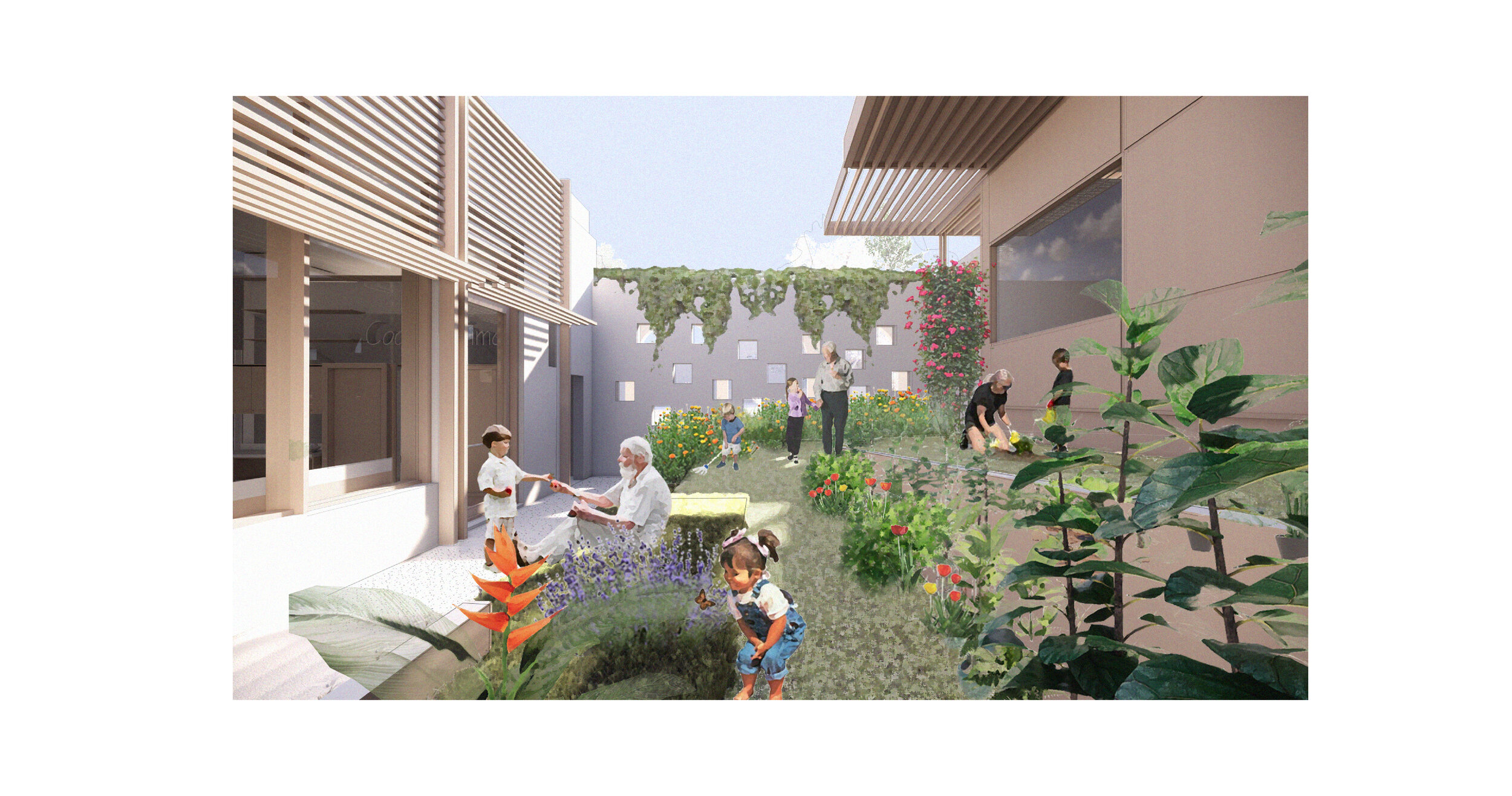
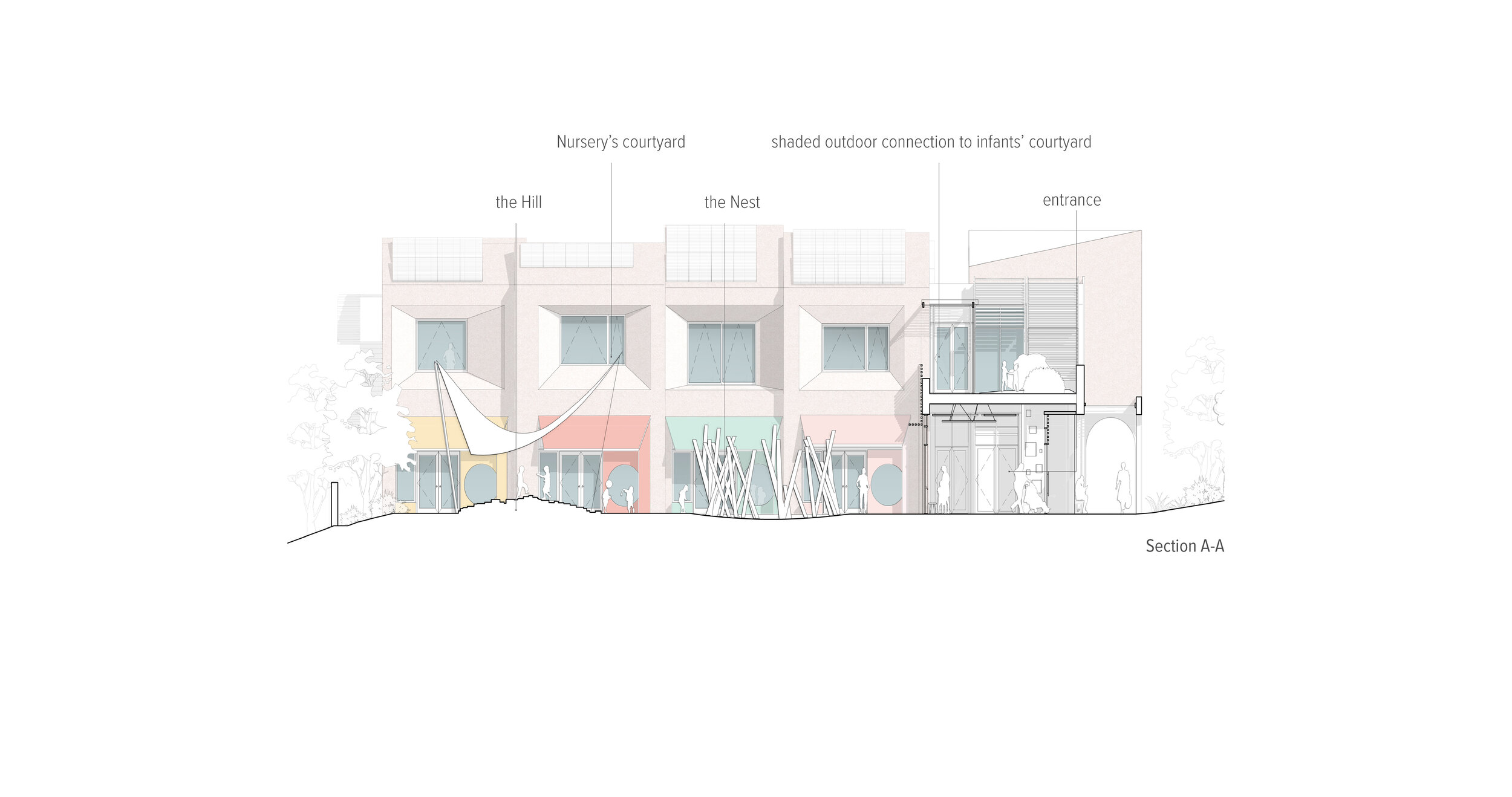
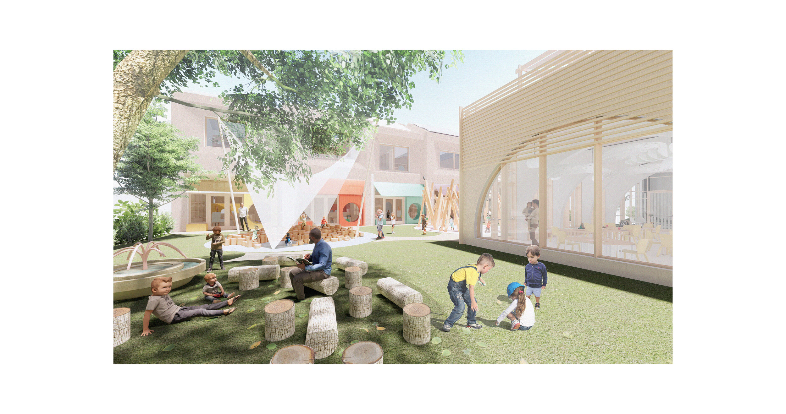
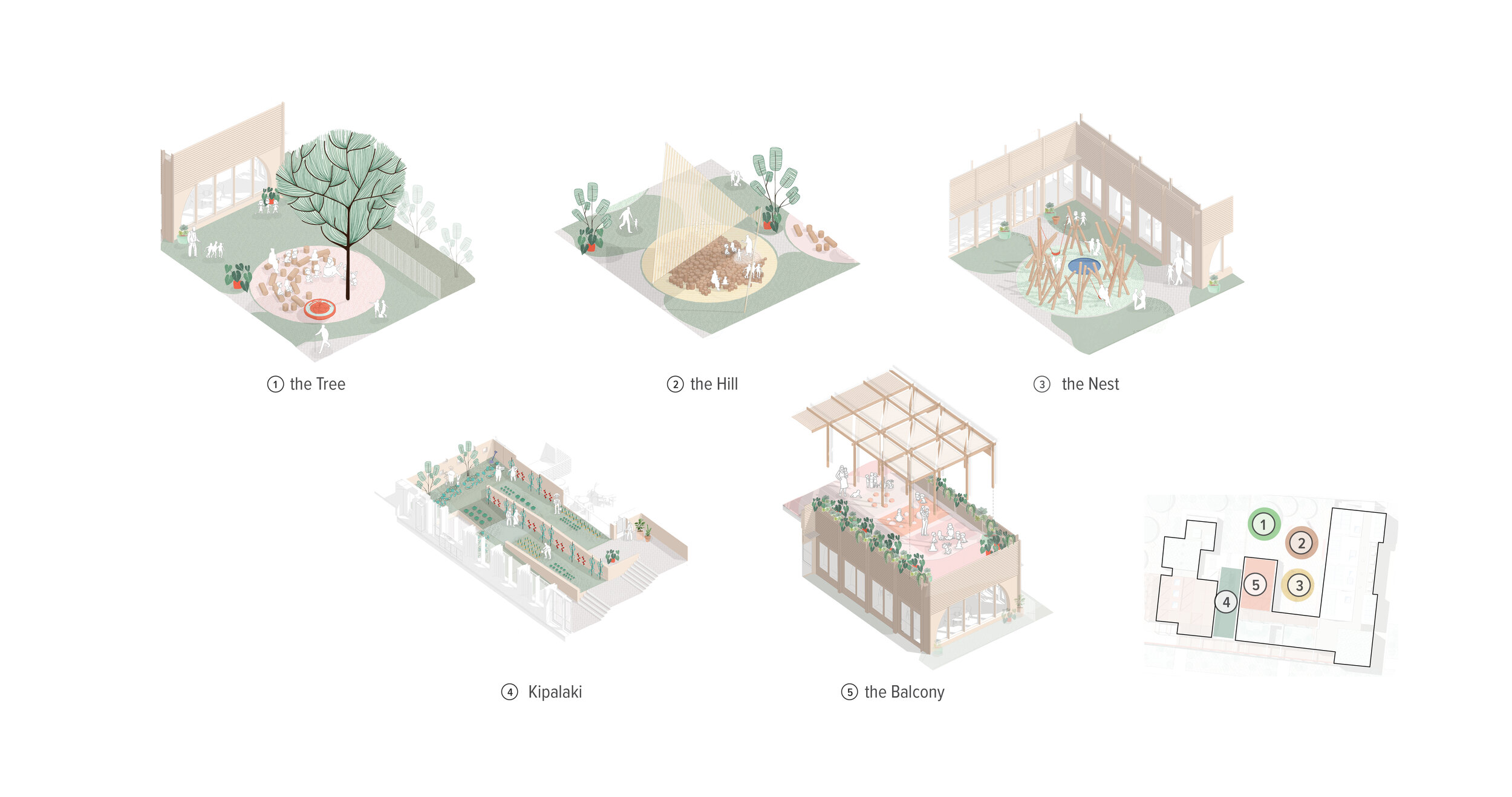
The positioning of these volumes on the plot is done in a thoughtful way to create three different outdoor areas. The first one, the kids’ courtyard, is naturally protected as it is located between the classrooms and the restaurant with immediate access from the Nursery’s entrance. The outdoor space between the kids’ restaurant and the Elderly Daycare Centre, the heart of the project, is a small allotment garden - the Kipalaki - where seniors and children can meet and spend time learning together from and engaging with Nature.
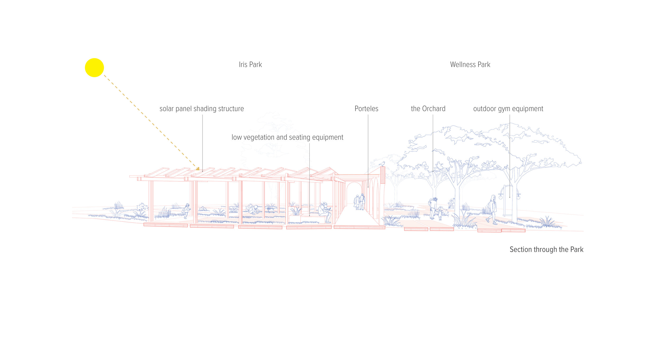
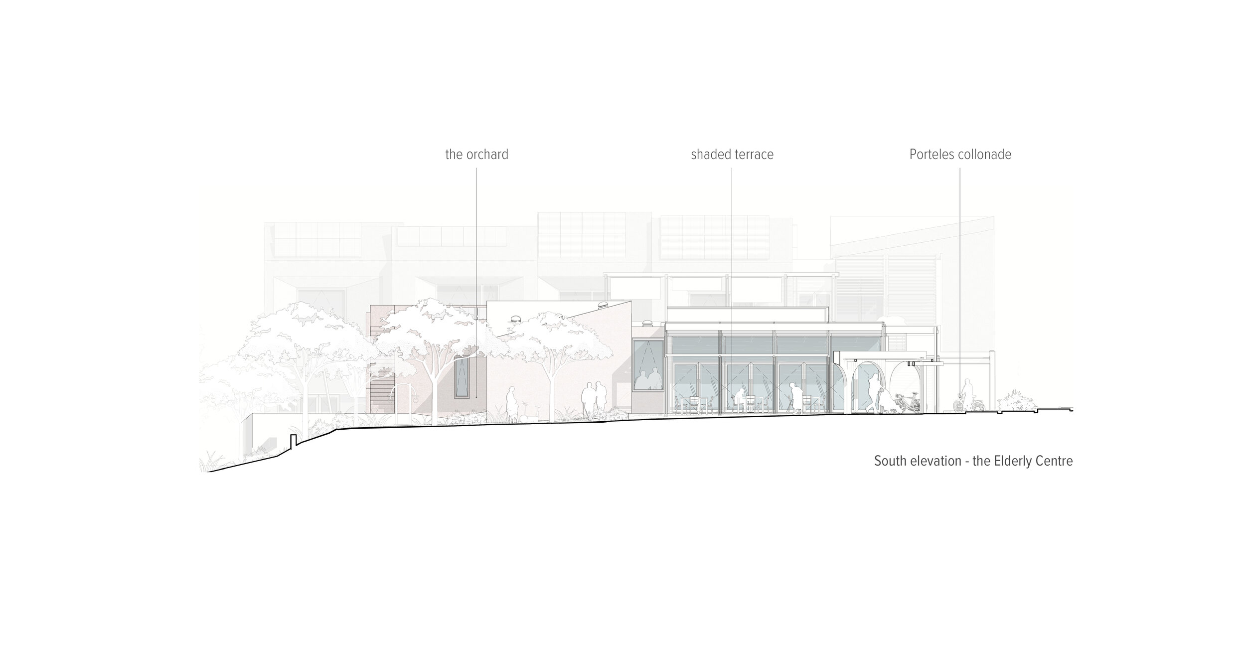
The third and larger open outdoor space, the public Neighborhood park, opens up to the South corner of the plot, inviting the community members to take advantage of the densely planted shaded area. The Colonnade is traversing across it and divided it in two areas complementary in character and function. Located by the Elderly Centre lies a dense orchard equipped with outdoor gym equipment between the trees, the Wellness Park. On the corner of the plot, a shaded multifunctional space with benches and low herbal plants under a timber structure, offers shade and the infrastructure for markets, exhibitions and other communal activities to take place, the Iris Park.
Architectural Design Tools
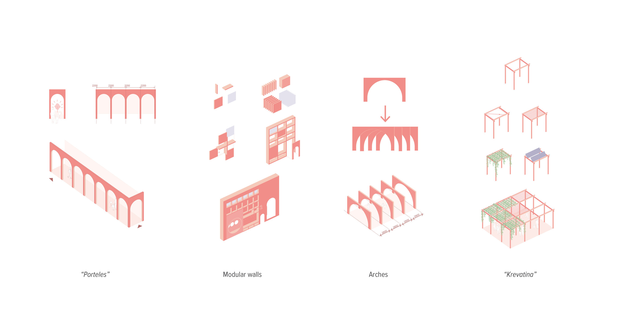
Inspired by the local architectural language, we make use of 5 elements with strong historical roots in the area translating them through modern construction into contemporary design tools.
Asymmetric volumes
Replicating the freeform and playfulness of the asymmetric and ostensibly unruly volumes of the traditional Cretan residential complexes - a result of an additive building process - we organize the different functions in orthogonal volumes that recess and project both in plan and section. We thus achieve a composition rich in plasticity yet modest and logical.
Porteles
Archways, or Porteles as they are called in Crete, are Venetian architectural elements incorporated in the Cretan tradition during the Venetian occupation of the island. They acted as gates or porticos to private houses or public areas. In our proposal, Porteles become a structure which defines the entrances to the individual functional units of the building, creates a new urban front and acts like a pedestrian shaded path.
The Arch
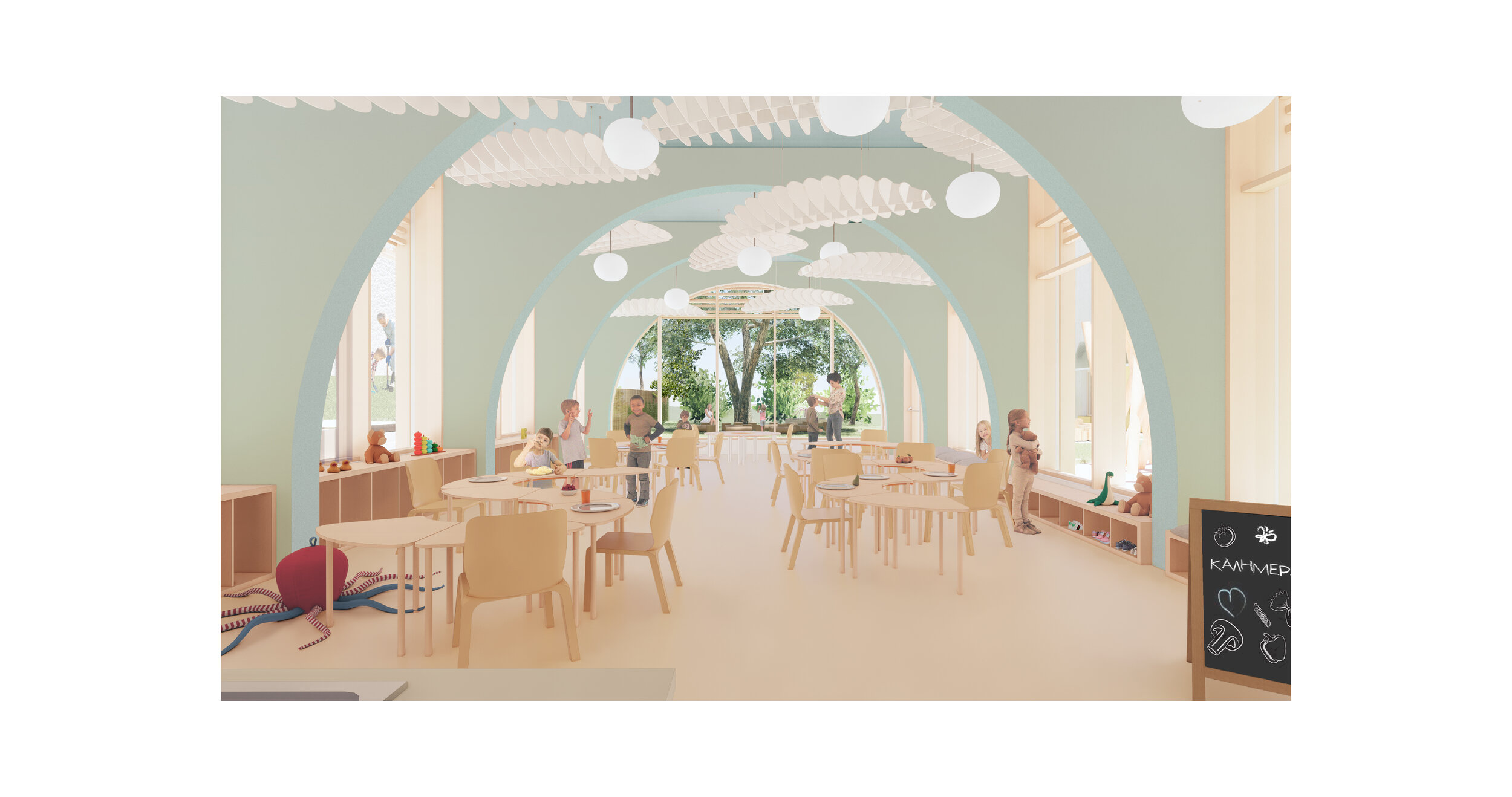
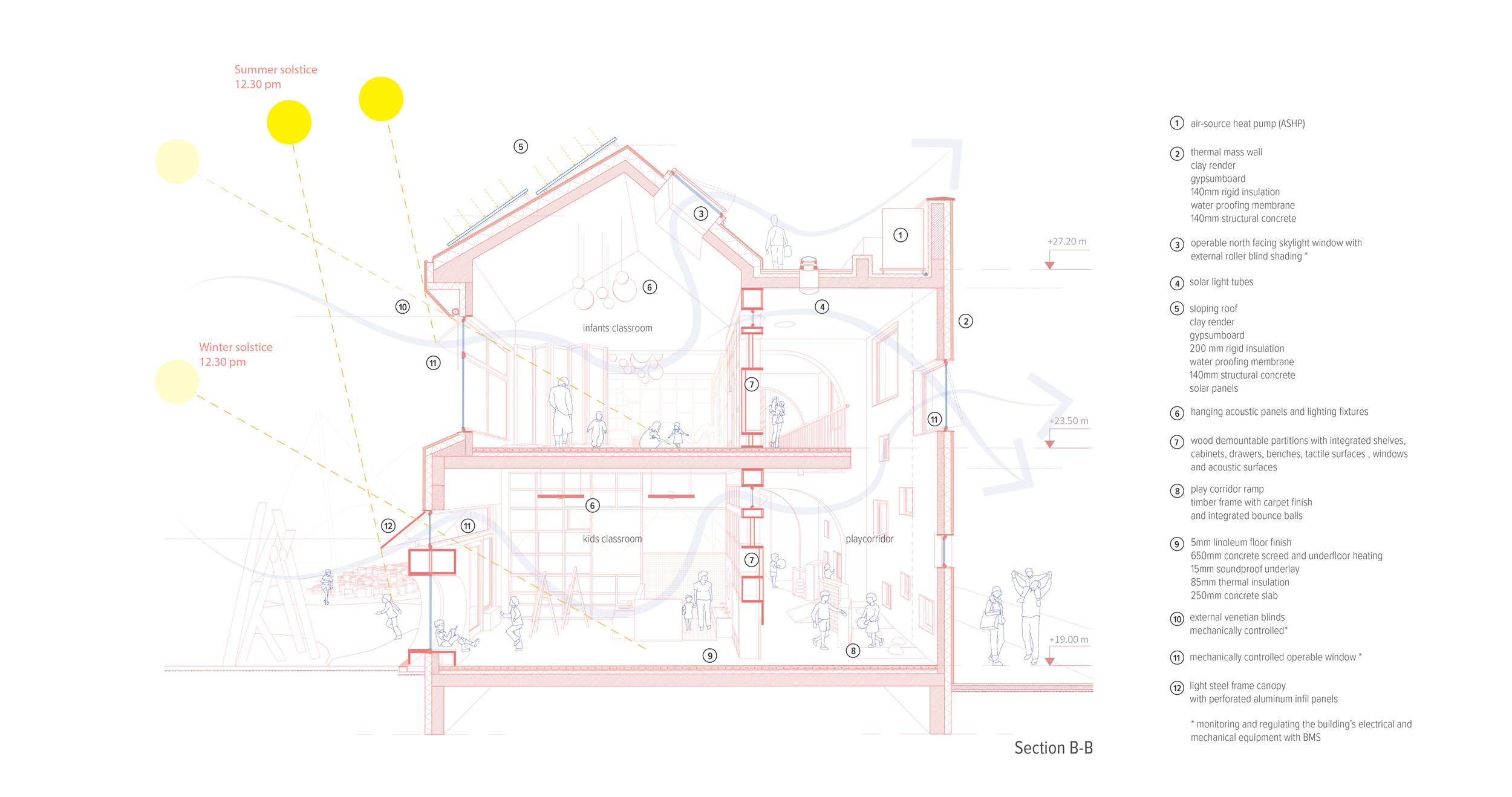
The Arch, a typical structural element of the traditional local architecture (ex. Kamarospita, mills etc) allow for big spans and heights in section, releasing the floor plan from columns and structural walls. Flexibility in the school design, essential to allow for changes in the pedagogical methods applied and crucial for a financially and environmentally sustainable design, is achieved here with the use of the Arch.
The Krevatina
Krevatina = a small bed in Cretan dialect, is a simple rectilinear frame of vertical and horizontal thin metal or wood elements that allow the plants, usually vine, to spread while it acts as a shading canopy. In our proposal, Krevatina spreads over outdoor and indoor spaces with its infill varying depending on the use of the spaceit covers; reeds and timber slats for circulation paths, fabric sails for the infant’s terrace, solar panels in the Neighborhood park etc.
Modular walls
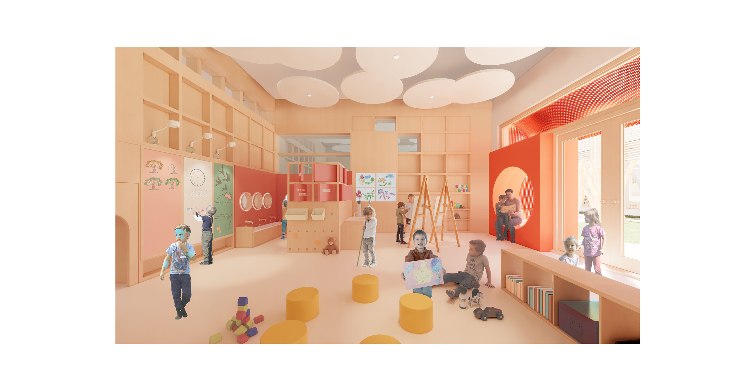
The partition walls of the Nursery school are designed as modular demountable walls made from prefab timber elements of local wood. The structural frame is designed as a grid with integrated solid acoustic panels, storage elements like cupboards, shelves, cabinets, educational games, magnetic pinup surfaces, soft seating, mirrors and openings. Thinking of space as an education tool we designed these walls as inhabitable elements to add to the visual learning opportunities found in the school.
The Nursery
Following the pedagogical principles of Reggio Emilia's approach, we consider the built environment as the "third teacher", a "home away from home". We design a warm, stimulating and sunny indoor environment that encourages learning through movement, socializing and contact with nature.
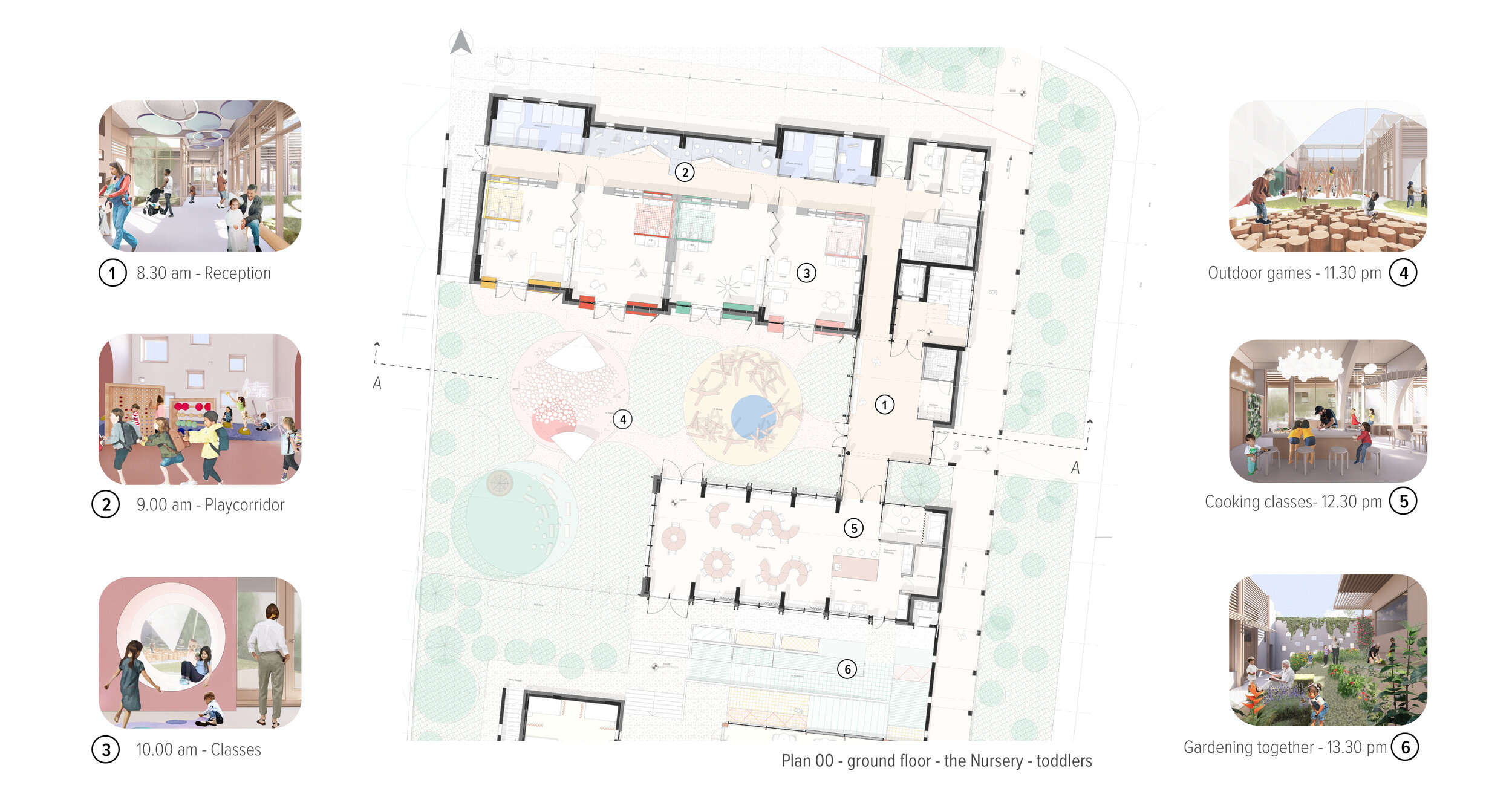
Essential conditions for the nursery’s spaces’ layout were the direct relationship of the classrooms with the outdoor courtyard, the South orientation of all main areas, the physical separation of preschoolers and toddlers, the creation of a fluid, stimulating, naturally lit and well ventilated interior environment and the design of a protected, shaded and playful outdoor space.
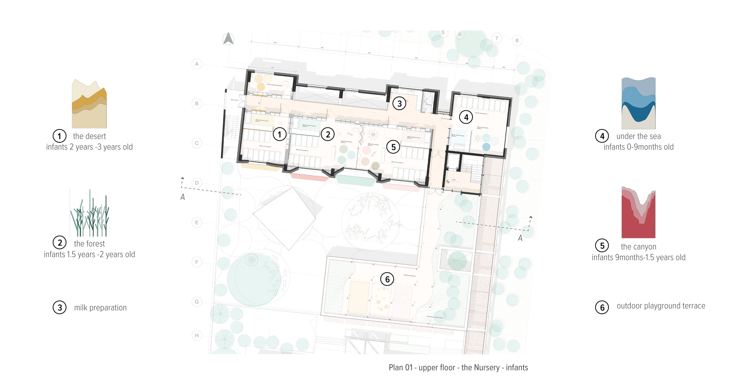
The 60 children were divided into four (4) age groups, in order to facilitate the educational work of the staff. The classrooms are located one next to each other with folding dividers between every two, increasing flexibility and allowing that they function in pairs. Each room has its own color palette, theme and signage so that the children's navigation is turned into a game and a sense of belonging to a team is created.
The north corridor leading to the classrooms is envisioned as an indispensable part of the kid’s daily routine, a Play Corridor rather than a merely circulation path. The double height Play corridor allows visual connection between the building’s levels and is lit by small openings on the North wall. The Play Corridor promotes informal interactions and functions as a secondary educational space, maximizing opportunities for experiential learning via movement and self directed play.
For the equipment of the yard, toys and constructions from wood and paving of the ground we suggest natural materials and the division into three distinct zones, the Nest, the Hill and the Tree. The volume of the building itself offers natural shading while awnings with bright colors define additional semi-outdoor spaces for each room. Our goal is to encourage the use of the courtyard beyond the break time as a place of activities and learning.
The restaurant, an elongated space that extends along the West-East axis, is envisioned as a space with a special architectural identity, reflecting the importance of meal time and ritual. Wanting to encourage the participation of children in this ritual, in the cooking and ultimately in the serving of food, we design an open kitchen with an island and counters of suitable height. The kitchen thus acquires an important role as a center - hearth - and the children are transformed from spectators to active members of their small community.
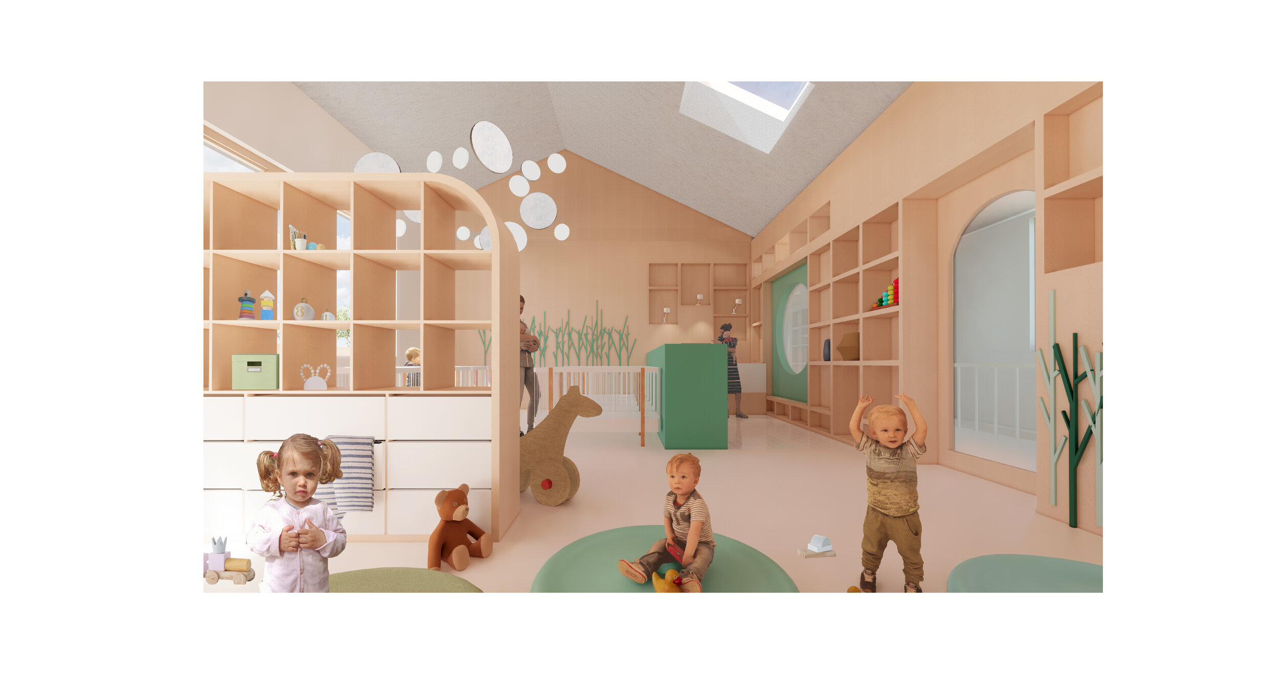
The Desert, the Forest, the Canyon and the Sea. The first floor accommodates four nature-themed rooms for the infants which include sleeping, play and wet areas that are only divided with folding doors in order to allow for maximum flexibility of use of the space. From here one has access to a terrace for outdoor activities shaded by the structure of Krevatina that covers most of its part.
Kipalaki
Kipalaki is where intergenerational interaction is achieved, bringing the elderly and the children together. The cultivation of aromatic plants and vegetables that all end up being used in the kitchen of the Nursery and Elderly Centre, highlights in practice an environmentally friendly attitude. Kipalaki thus functions as another social and learning space, an example of an alternative education model.
The Elderly Centre
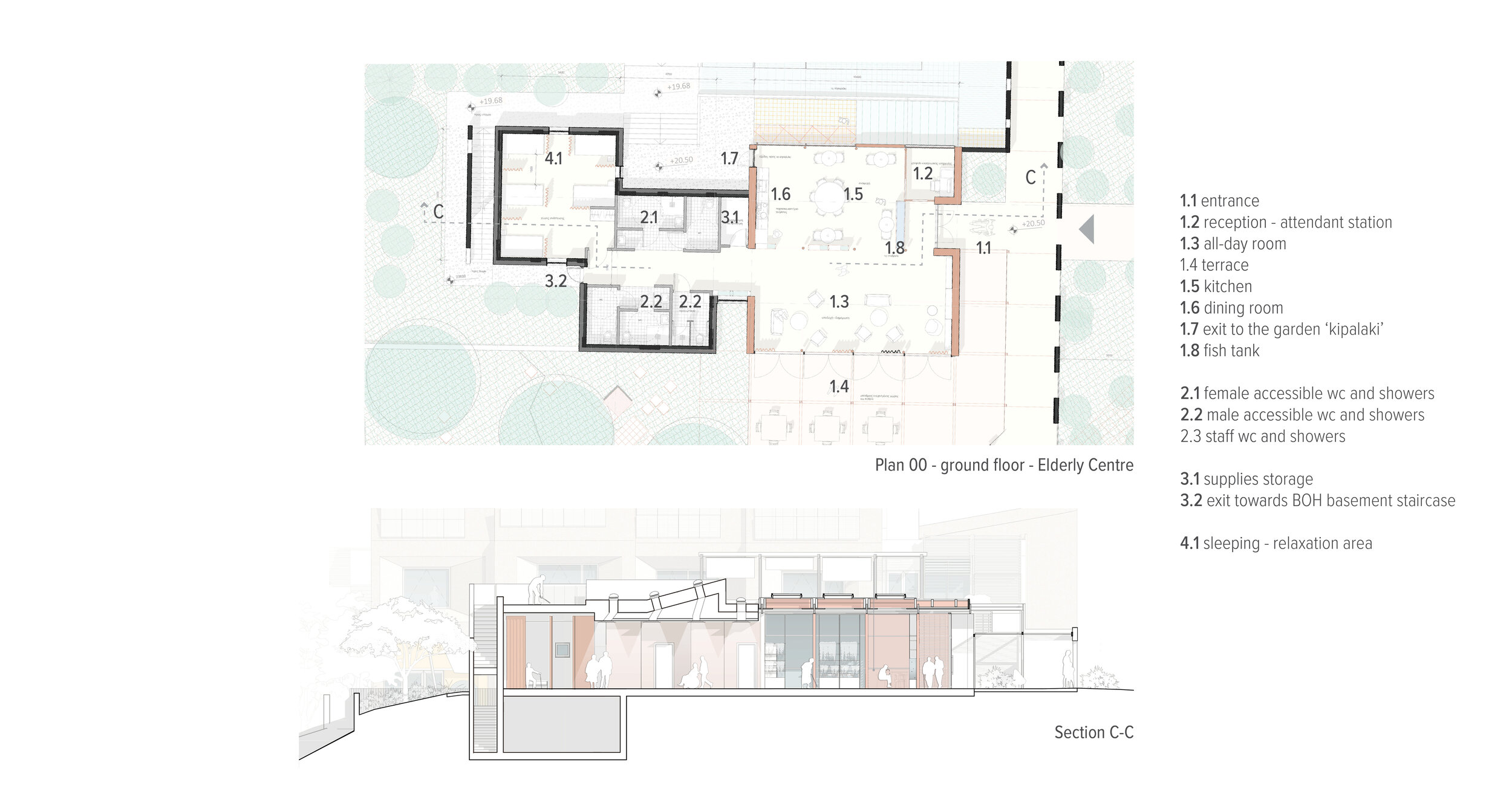
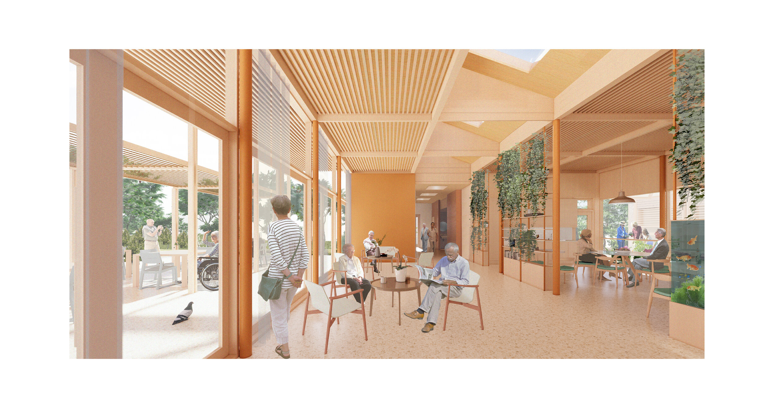
Our design proposal for the Elderly Care Centre aims to maximize the autonomy and conditions that allow the well-being of senior people, and wants to demonstrate that social inclusion and a decent living can be achieved through sensitively designed buildings, through a thoughtful healing architecture.
Inspired by the typical informal meeting place found traditionally in squares of small communities in the mediterranean area, we envisioned and designed the Elderly Centre as a kiosk, a pavilion, a friendly inviting meeting point for the locals to come together under the shade. The pavilion opens up to the public Neighborhood Park; a folding glazed facade brings the outdoors indoors while the lightweight timber roof expands in all directions. We envision the Elderly Center becoming a hub and a reference for both users and the community.

